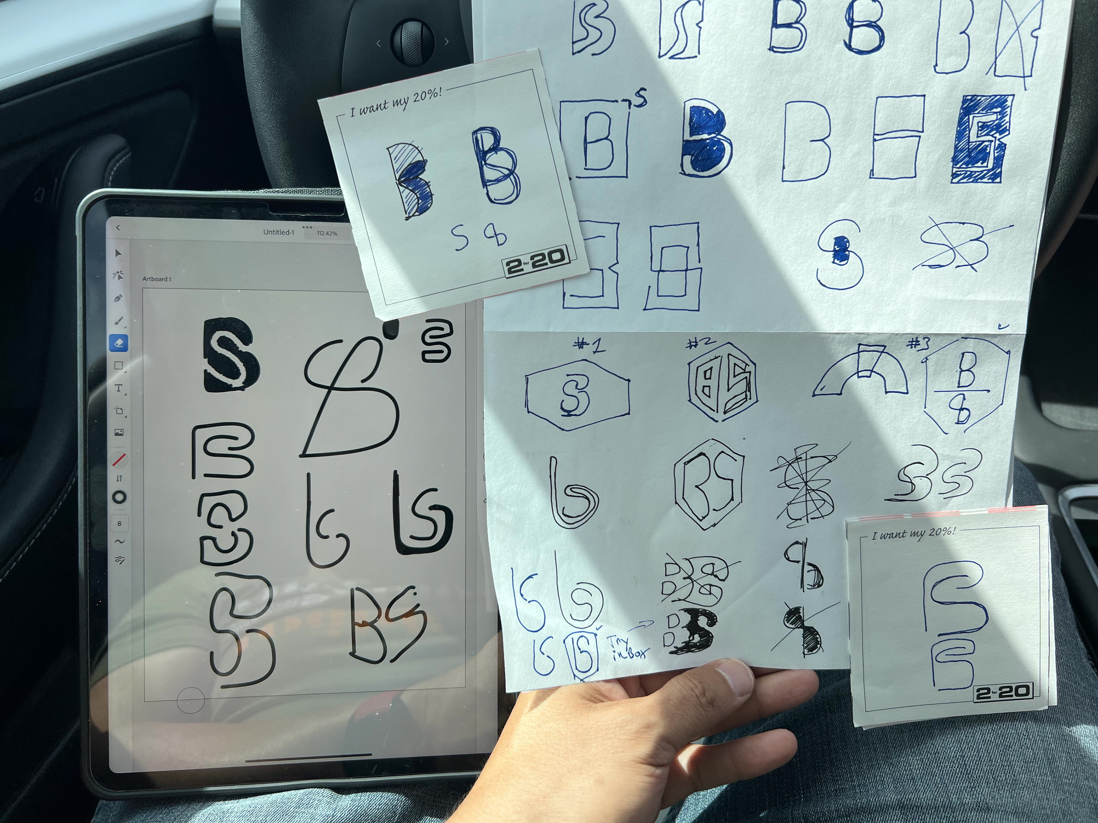
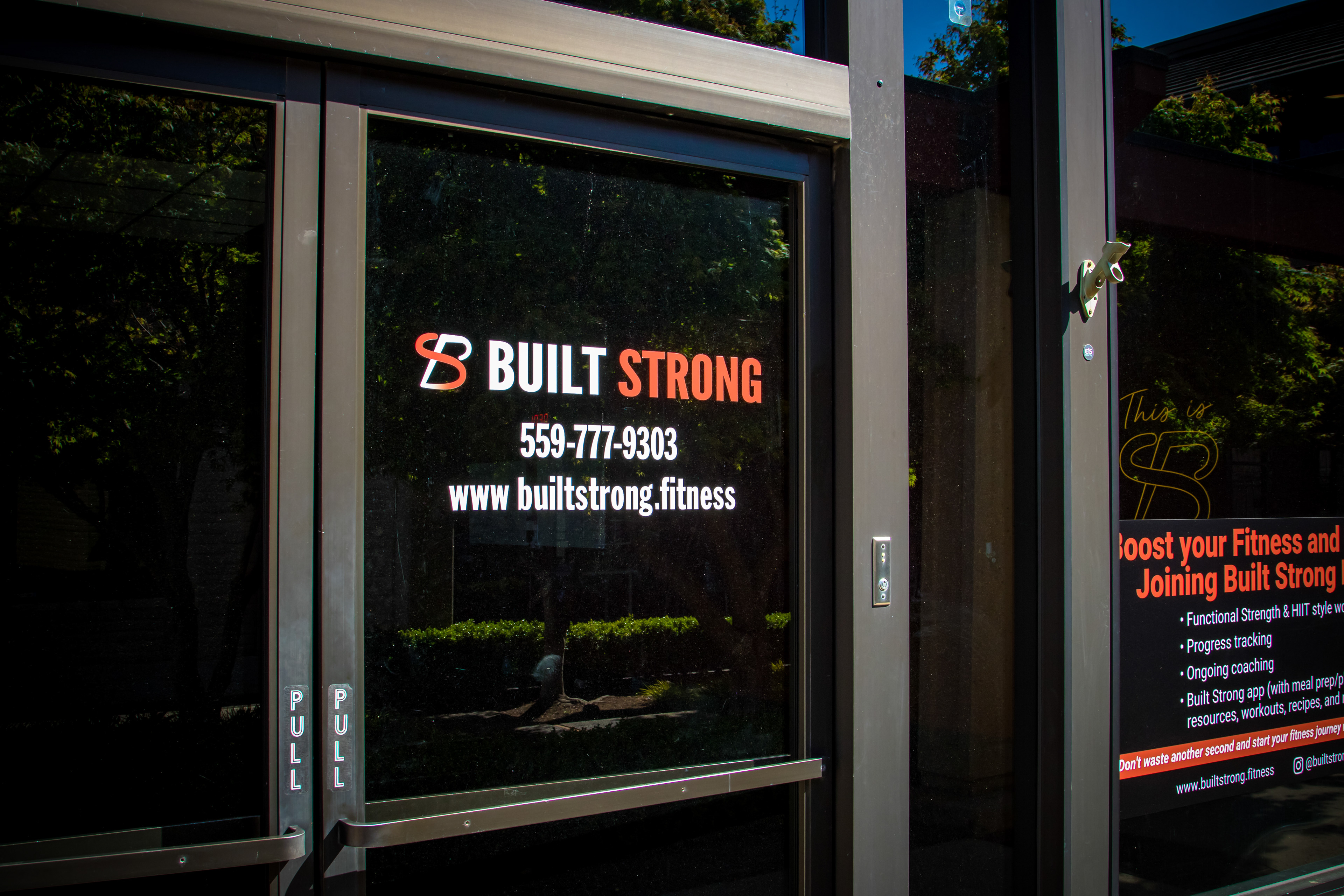

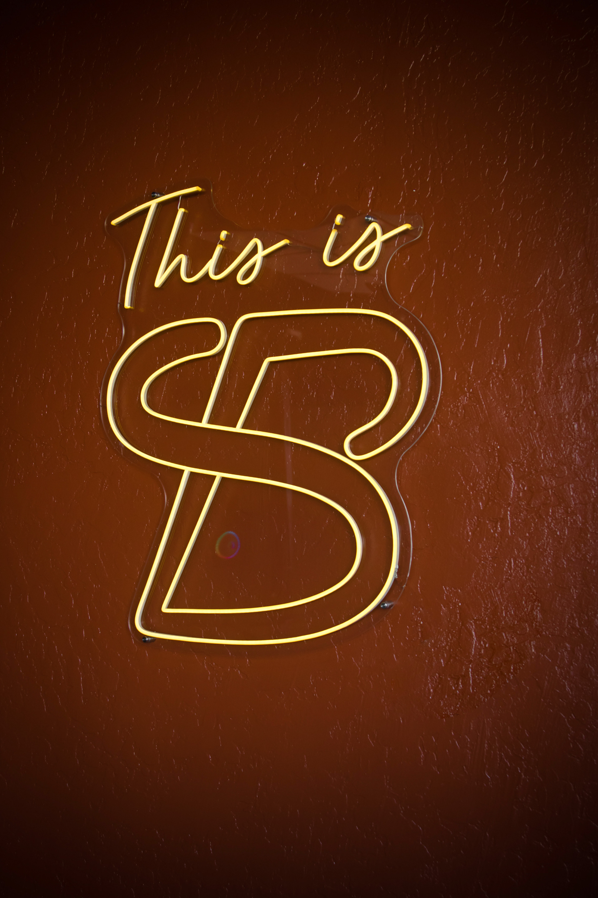
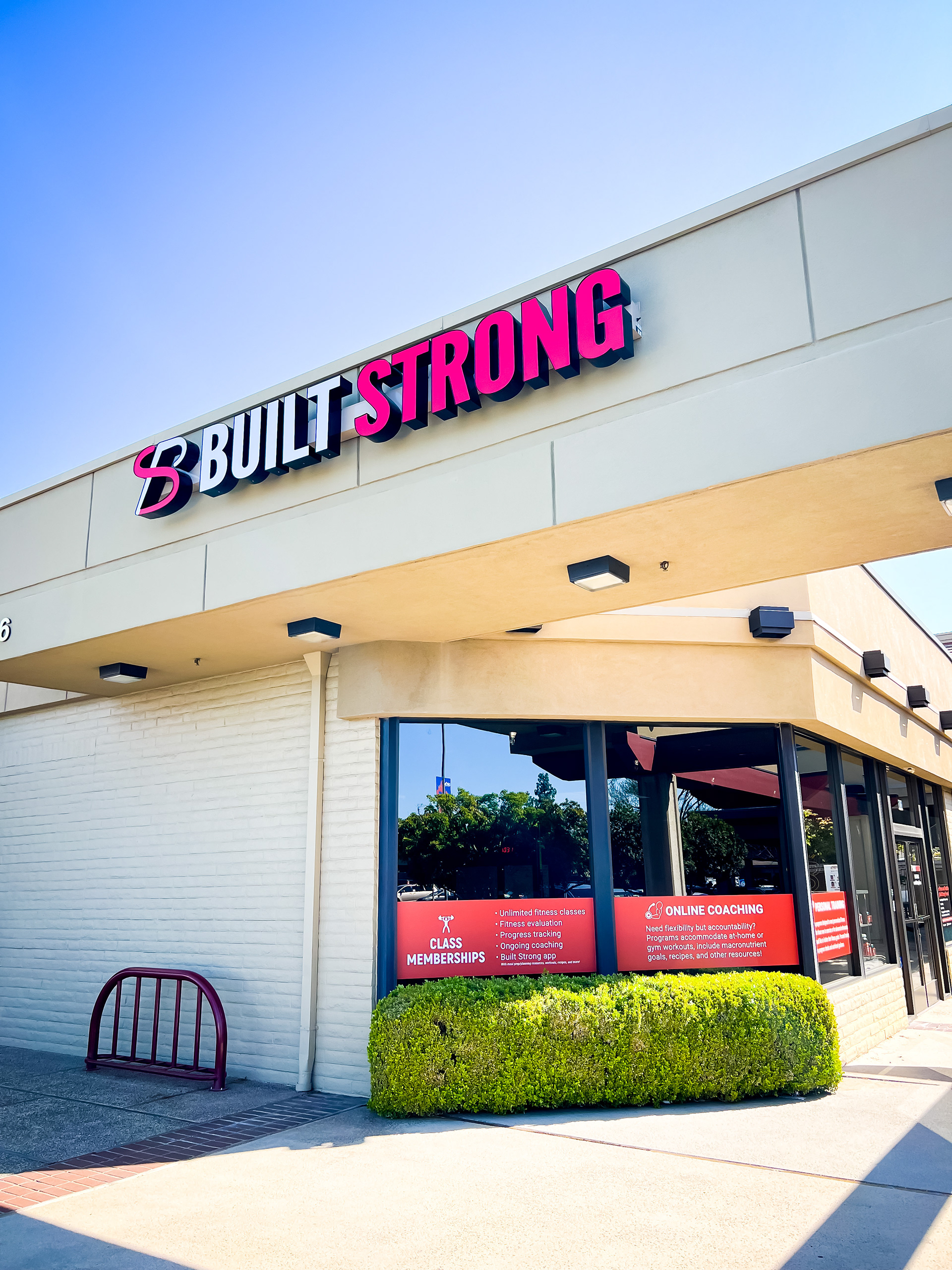
When the owners of Built Strong set out to create a boutique fitness studio, they wanted a brand that felt powerful yet personal, and in our initial meeting we came up with "industrial chic". My role was to translate that vision into a visual identity that embodied strength, energy, and individuality. The final mark was a bold fusion of the letters B and S, became the cornerstone of their brand system. What started as a potential design challenge (“BS”) turned into an opportunity for a little personality. The gym proudly displays a neon sign reading “This is BS.” It’s a cheeky nod to getting up at 4 am to work out at the gym and in tune with their clientele. From early sketches and mood boards to signage, postcards, and mobile graphics, the brand evolved into a complete identity that worked across environments. It’s a reminder that strong brands, like strong people, are built from consistency and a little humor. Key roles: Brand identity, logo design, art direction, collateral design, environmental branding.